Mobile Website Design - A 1.9 Billion Opportunity
by Ben Wilson on May 3rd, 2016
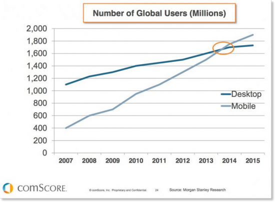
More than 1.9 Billion People Access the Internet on their Phone. Digital media consumption on mobile devices is skyrocketing compared with desktop usage. Are you ready?
What is Mobile Website Design?
If you’re looking to get the word out about your small business, responsive design websites are the way to go. Responsive design websites tailor websites for mobile devices and tablets by re-sizing content to fit any screen. Businesses who want to reach people who browse the internet not only while in front of their desktops but also in their free time during their commute must have a website that provides a beautiful user experience on mobile devices and tablets. Mobile website design optimises websites to ensure higher conversions and better sales for your business.
This VIDEO explains what responsive website design means.
Mobile internet usage on the rise.
In most parts of the world, mobile internet use is cheaper and more convenient than desktop browsing. Last year 200 million people obtained access to the internet – mostly through their mobile phones. This has created a new market of mobile consumers that will continue to grow as more and more people get connected to the internet. Combine that with the fact that the majority of internet users spend more time browsing on their phones than their desktops, it’s easy to see why a responsive web design is a priority.
How to create the best responsive websites.
It is increasingly important for people to be able to view websites on their phones without visual glitches or long loading times. Mobile internet users perform tasks on their phones that used to be reserved for desktop computers, and they expect to quickly browse and shop no matter which device they’re using. Slow loading times and scrambled content are barriers to mobile browsing. 64% of mobile users wait no longer than 10 seconds before abandoning a page. This means slow loading times can increase your page’s bounce rates and lower website traffic and conversions, ultimately affecting your bottom line. This is all completely avoidable if a website is designed with mobile users in mind. The Web Force 5 content management system has been designed to allow you to create stunning content that adapts for the optimum user experience across all devices.
Web Force 5’s responsive website platform is easy to use and helps you to create fully-responsive, website content, shopping products and e-marketing initiatives without any special technical skills. In addition, the platform is constantly being enhanced and upgraded with new functionality.
Our responsive web design specialists will work with you to create the best responsive website design for your business and configure the system so that you become immediately independent. Whether you’re new to the web or have created websites before, our experts will guide you through the ins and outs of responsive website design. Web Force 5 also offers monthly website reviews and planning meetings for all customers in order to ensure that you have the support and guidance that you need in order to set your small business up for success. Make sure your small business is ahead of the game by building a responsive website with Web Force 5.