Switching To Mobile Responsive Website
by Ben Wilson on April 25th, 2015
It’s no longer up for debate. The advent of mobile phones has made a huge impact on the online space and in 2014 visits to websites from mobile devices exceeded visits from desktop computers.
The mobile apocalypse has begun.
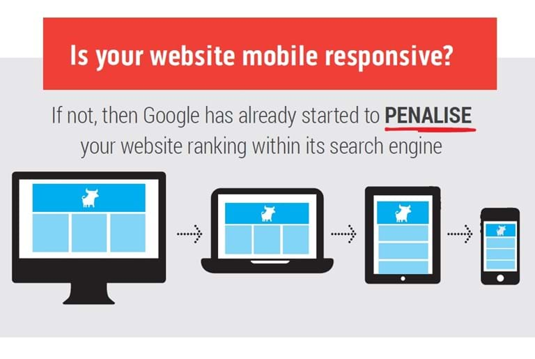
On April 21, 2015, Google released a mobile-friendly update to their ranking algorithm that has had a game-changing effect on how many businesses address the online component of their business strategy. The Google algorithm changes are designed to favour responsive websites for Google’s searches made using a mobile device. Some businesses have already noticed dramatic changes in the mobile search results since the update’s release.
Responsive mobile website design is a must.
With millions of users today relying on their handheld devices to search for information online, it’s easy to see which direction web search is heading – MOBILE.
To keep up with this browsing trend many businesses have built mobile-friendly websites – separate websites configured to provide a good mobile browsing experience. This strategy is not consistent with Googles preference because having a separate website for mobile searches means Google has to index (rank) two versions of the same content an manage two different URL’s for the same content.
The Google algorithmic changes are demanding that websites employ “responsive” technology – the website changes how it is displayed based on the device that the search is initiated from. For a more detailed explanation of how responsive websites work view the video.
Understanding how the changes imposed by Google can impact online visibility, many website owners have made the move to a responsive website platform. This move has in many cases been a difficult and expensive exercise for businesses that have websites that are built using a traditional custom code approach. In many cases business owners are being told that it is impossible to make their current website responsive and as such they have to completely redevelop their website. For businesses whose target audience are active on mobile devices they have had no option other than proceed with that redevelopment.
Although the types of frustrations mentioned above are not something Web Force 5 customers need to concern themselves with – the Web Force 5 platform is responsive – the following is offered as a guide to businesses that are considering or evaluating the move to a responsive website platform.
Developing A Mobile Website Strategy
If your target audience is likely to find you via a Google search using a mobile phone, tablet or some other mobile device then the move to a mobile responsive website platform is a must. Take it from Google’s philosophy: Focus on the user experience and all else shall follow. With a well-structured mobile site, you’ll be providing old and new customers a great mobile experience and will be rewarded by Google.
What you can do:
-
Determine whether your site is mobile-friendly. Fortunately, Google provides a number of tools that can help you determine how compatible your site is with mobile. Take advantage of these tools or ask your current website provider about your responsive options.
- Know how your audience behaves. The general strategy to enhance customer online engagement is by understanding how they behave when searching for content on your website. Google Analytics will provide fantastic insights as to how your target audience behaves and the content they want. Use that information when structuring your mobile responsive website so that your target audience can get to the content they want quickly and intuitively.
- Find out which of your competitors have switched to mobile design. It’s a good idea to analyse which of your competitors has moved to a responsive platform. Making the move to responsive may provide you with an opportunity to gain an advantage over your competition by ranking better for mobile searches.
- Make things mobile. Apart from your site, you need to make other aspects of your marketing mobile-friendly, including email. According to Google Mobile Planet 2015, 82% of smartphone owners use their devices for email. It’s quite clear that emails and the email marketing system that is incorporated to your website should also be mobile-friendly.
The future is mobile responsive. Don’t get left behind. Make the switch now.
At Web Force 5, we provide top quality responsive website development services for the small business owner.