Google Mobile First Index: A New Mobile Crawler is Born
by Ben Wilson on December 20th, 2016
If a website isn’t going to work as a sales machine for your business, it’s not worth sitting on a server you are paying for.
Don't you think?
Too many websites are terrible when it comes to a good user experience which includes content, navigation, and usability. Plus, how your website displays on a mobile device is now more critical than ever.
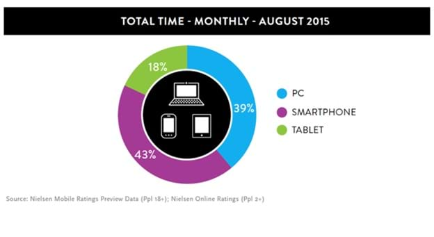
According to Neilsen, more than 15 million Australians now own a smartphone and another 12 million own a tablet device. Time spent by an average Australian on a mobile is about 43%, compared to 39%of time spent on desktops and 18% of time spent on tablets.
Read this five years from now, and the numbers are going to be staggering, with mobile as the clear winner.
ComScore reveals that most millennials are already mobile users (97%). Those in the age group 35-54 are multi-channel platform users. Only those at the upper end of the scale (quite a sizeable chunk) still primarily use a desktop computer.
Clearly, websites don’t just have to be sales machines; they have to adapt to screen sizes, look good, allow for easier navigation, and make it easy for visitors to find what they are looking for.
Google knows that, and it explains the search giant’s latest move to experiment with their new mobile-first index update.
Mobile-first Indexing explained
Google currently has only one index based on a website’s desktop version. 'Mobile-friendliness' was only one of the various factors the Googlebot took into account while searching, sorting, and listing web pages. While the algorithm still continues to use a single index, the new mobile crawler will start ranking pages from your website. It’ll begin to interpret the structured mark-up of your site and will show 'mobile-only' snippets to 'mobile users'.
While the algorithm still continues to use a single index, the new mobile crawler will start ranking pages from your website. It’ll begin to interpret the structured mark-up of your site and will show 'mobile-only' snippets to 'mobile users'.
Google now seeks to stop an average user's 'jarring experience' of clicking through a snippet (or a search listing) only to reach a 'mobile-responsive website', but not find what they were looking for. Instead, they'll end up looking at a newsletter pop-up or an app.
Google’s new mobile-first index signals a shift in indexing. The new index will be built with 'mobile documents', and all this is designed to improve the search experience for users, regardless of the device.
If you have a desktop site and if it’s not mobile-responsive, the mobile crawler will still index your desktop site. According to Google’s Official Blog, a functional desktop site is better than having a broken or incomplete mobile-responsive version.
How Do I Get Google Mobile-first Index Ready?
Ensure that you have a well-designed, mobile-responsive website.
Ryan Jones of Search Engine Journal advocates using “good information architecture, content strategy, and UX." He recommends using micro formats, schema, and hreflang on website pages. Furthermore the process of using short cuts and techniques where visitors are redirected to mobile versions of your website should be avoided; just build a mobile responsive website instead. In fact, it’s better to just serve the desktop version to your visitors instead of using any tricks, whatsoever.
In terms of your organic search ranking potential, proper page structure is critical. To see how your pages are structured, you can use the Structured Data Testing tool. Each page should only have mark-up that is specific to the information on those respective pages (for instance, avoid the temptation to stuff loads of meta-descriptions and keywords in to pages).
There’s a lot of technical jargon and items that you need to consider for your website, your website visitors and the websites SEO ranking potential. Thankfully, with Web Force 5’s content management system (CMS), this is all taken care of.
Many other mobile website development services don’t take the time to address basic technical requirements, let alone the complexities that need to be considered with responsive website design services.
At Web Force 5, we take the hassle out of designing the best responsive websites. With our mobile-responsive and easy-to-use CMS, you get a mobile-responsive design as standard and not as an afterthought. Mobile website design is already an integral part of the Web Force 5 system, and we are compliant with Google’s Mobile-first Index.
Moreover, you can add pages, image galleries, and content which will automatically adjust to the user’s device. You can also edit important SEO elements such as page titles, page descriptions, headings, image tags, alt text etc., easily.
Get complete control over how your website displays, how Google interprets your website, and how your images, pages, and other content are structured and viewed by Google.
Are you ready for Google's new mobile-first Index? Talk to us!
